A quick look at CSS Flexbox properties
In this blog I explain the important Flexbox properties in brief.

The CSS Flexbox (Flexible Box) layout allows us to align, allocate and distribute different elements within a certain available space.
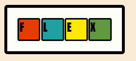
Once display:flex is assigned to an element, the parent becomes the 'flex-container' and the elements within that parent (child) becomes 'flex-items'.
A 'flex-container' has two axis along which the flex properties are applied,
main-axis: It's the primary direction along which the flex items are laid out. By default it goes from left to right.
cross-axis: This axis is perpendicular to the main-axis.
Note: once an element is declared 'flex' no matter if it's a inline or a box element, it will always behave as if it's a inline element and will only take up as much space as it has contents within.
Flex properties can be divided into two parts based on which those properties applies to, 'Parent Properties' are those that applies to the flex container and Child Properties are those that applies to the flex items.
Parent (flex container) Properties:
flex-direction:
This declares the main-axis of the flex items along which they're laid out.
.container {
  flex-direction: row | row-reverse | column | column-reverse;
}
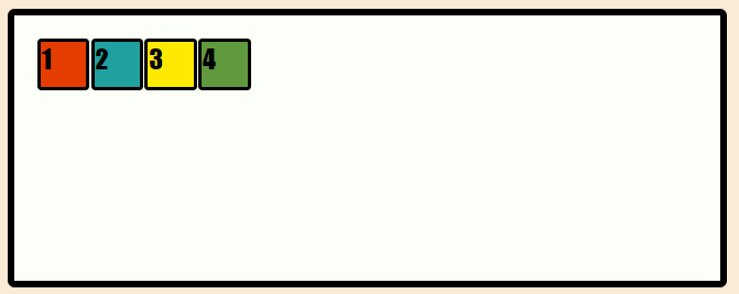
row: This is the default direction where the items are laid out left to right in a row.
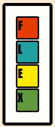
column: flex-direction: column; rearranges the flex items and places them vertically in a column from top to bottom order.
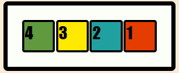
row/column-reverse: flex-direction: row-reverse; and flex-direction: column-reverse; re-arranges the flex items along the main axis.
justify-content:
justify-content flex property allows us to align flex items along the main axis, with these properties we can distribute remaining space of the flex container between the flex items.
.flex_container {
  justify-content: flex-start | flex-end | center | space-between | space-around | space-evenly;
}
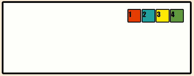
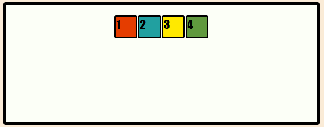
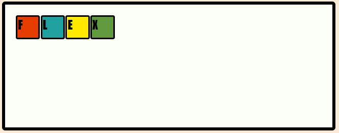
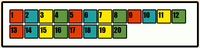
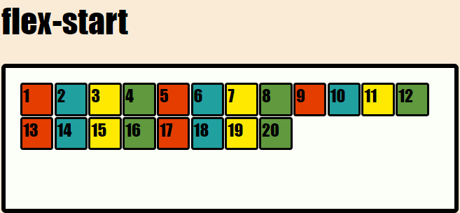
flex-start: justify-content: flex-start; is the default position where items are placed toward the start of the main axis.
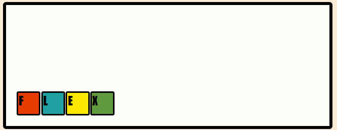
flex-end: justify-content: flex-end; places the flex items toward the end of the main axis.
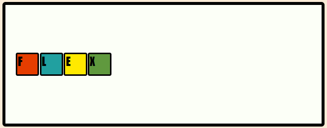
center: justify-content: center; centers the flex items along the main axis.
Let's say there's n amount of extra space left. That space is divided into two even spaces n/2 and allocated toward the left and right of the item stack so it's now positioned in the middle of the main axis.
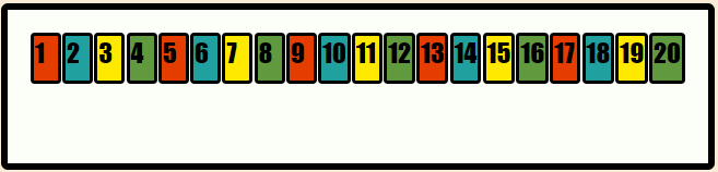
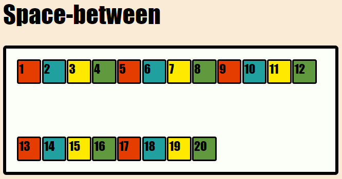
space-between: justify-content: space-between; takes all the remaining space and distributes evenly between the flex items, the first flex item is positioned at the beginning of the main axis with no space in it's left and the last flex item is positioned at the end of the main axis with no space in it's right.
Let's say there's n amount of extra space left and there are 4 items, the space is divided into n/(4*2-2) even spaces, now n/6 spaces are allocated at both sides of the middle items. The first item gets n/6 space to it's right because it's at the start of the main axis and there's no space toward the left of it, and the last item gets n/6 space to it's left because it's at the end of the main axis and there's no space toward the right of it.
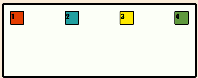
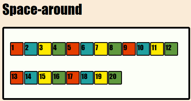
space-around: justify-content: space-around; distributes the remaining space evenly between and around the flex items, the first flex item is positioned at the beginning of the main axis with equal space in it's left and the last flex item is positioned at the end of the main axis with equal space in it's right.
Let's say there's n amount of extra space left and there are 4 items, the space is divided into n/(4*2) even spaces and n/8 spaces are allocated at both sides of all the items.
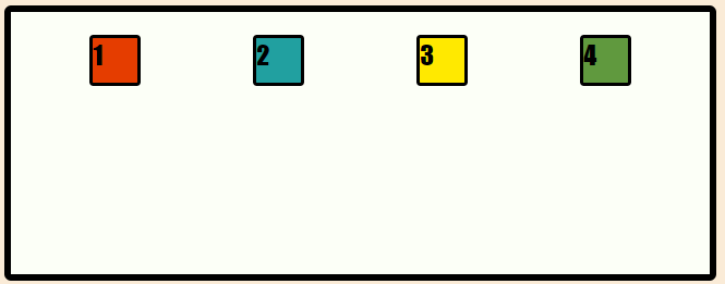
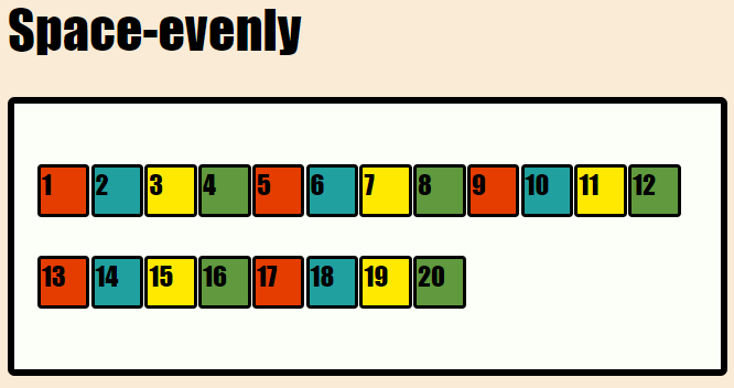
space-evenly: justify-content: space-evenly; distributes the flex items along the main axis so that the spacing between any two items and the spacing from the edges of the flex container are equal.
Let's say there's n amount of extra space left and there are 4 items, the space is divided into n/(4+1) even spaces, now n/5 spaces are allocated at the start, at the end of the main axis and in between two items, making them evenly spaced from flex start, flex end and each other.

align-items:
This defines how the flex items are laid out along the 'cross-axis', you can think of this as the justify-content for the cross axis.
.flex_container {
  align-items: flex-start | flex-end | center | baseline;
}
Stretch is the default position where items are stretched to fill the container.
flex-start: align-items: flex-start; places the items at the start of the cross axis, the difference between this and justify-content: flex-start; might not be visible at first but both are completely different properties as both follow different axis (main and cross).
flex-end: align-items: flex-end; places the flex items toward the end of the cross axis.
center: align-items: center; places the flex items along the center of the cross axis.
baseline: align-items: baseline; places the flex items along the cross axis such that their flex container's baselines align. According to MDN ->(The item with the largest distance between it's cross start margin edge and it's baseline is flushed with the cross-start edge of the line.)
Read this to understand flex container baseline.
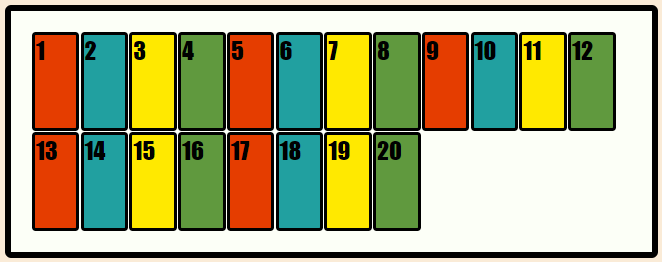
flex-wrap:
By default, flex items will try to fit into a single line, we can avoid that by assigning the flex-wrap properties, where the items follow the flex direction (ltr or rtl) and wraps along the cross axis.
.flex_container {
  flex-wrap: nowrap | wrap | wrap-reverse;
}
nowrap is the default state where all flex items are in a single line.
flex-wrap: wrap; will make flex items wrap into multiple lines along the direction of cross axis.
flex-wrap: wrap-reverse; will make flex items wrap into multiple lines along the opposite direction of the cross axis.

align-content:
This property aligns the contents of a flex container aligns the cross axis when there are multiple lines of flex items and flex-wrap is set set to either wrap or no-wrap .
.flex_container {
  align-content: flex-start | flex-end | center | space-between | space-around | space-evenly | stretch;
}
flex-start/ flex-end: align-content: flex-start; places the wrapping flex items along the start of the cross-axis. flex-start follows the flex direction where start follows the direction of the writing mode.
similarly, align-content: flex-end; places the wrapping flex items along the end of the cross-axis.

center: align-content: flex-center; centers items along the cross axis.
space-between/around/evenly: These properties will distributes the remaining available space around the items as explained in the justify-content section of this blog.
stretch: Instead of distributing spaces between items, align-content: stretch; stretches the items to take up the remaining space.
Child(flex items) Properties
These properties applied onto the child elements(flex items).
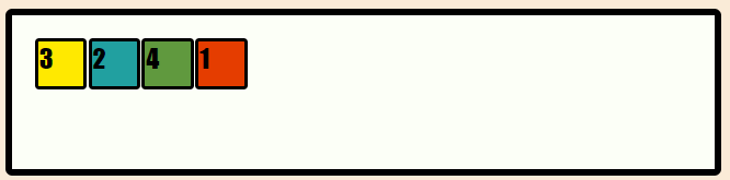
Order: The order property allows us to rearrange the items in a flex container, all flex items have a default order value '0' and they're laid out according to the order in which items are mentioned in the html, we can assign orders to these items ranging from negative to positive values to rearrange them as we want. Order follows the direction from start of the axis towards the end in an ascending manner of values.
example:
.flex_items:first-child {
    order: 2;
}
.flex_items:nth-child(3) {
    order: -1;
}
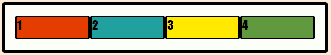
here, the first-child of the parent which is '1' gets an order of 2 which is greater than the default order of '0', so it's placed along the end of the items. whether the 3rd child gets an order of '-1' which is less than the default '0', so it's placed at the beginning of the line.
flex-grow: This property dictates how much of the available space will be given to each child items, grow is an unit-less value which means the proportion of space one item will get.
example:
.flex_items {
    flex-grow: 1;
}
when flex-grow is set to 1, all remaining spaces are divided into 4 parts and each item gets 1/4 of that space.
.flex_items:first-child {
    flex-grow: 2;
}
.flex_items:nth-child(2) {
    flex-grow: 1;
}
.flex_items:nth-child(3) {
    flex-grow: 1;
}
.flex_items:last-child {
    flex-grow: 3;
}
here, the remaining space is divided into 7(2+1+1+3) equal parts, where first child has a flex grow set to 2 so it gets 2/7 part of the spaces. both 2nd and 3rd child gets 1/7 part of available space as both have flex-grow set to 1. While last child gets 3/7 part of the available of spaces as it's flex-grow is set to 3.

flex-shrink: This is similar to flex grow, but it shrinks the item volume according to it's shrink value.
align-self:
align-self works similarly to align-items that are explained above. The important difference between them are that,
align-items -> controls alignment of all items on the cross axis.
align-self -> controls alignment of an individual flex item on the cross axis.
flex-basis:
The concept of flex-basis is similar as flex-grow. The only difference being,
flex-basis controls how large an element will be along the main-axis before any growing or shrinking occurs. Flex-grow determines how much it will grow in proportion to sibling elements.
if it's set to '0' the extra spaces around the content isn't factored in, if it's set to '1' then that extra space is distributed between the contents.

Thanks for reading this blog :)


