CSS #Grid#

Grids are two dimensional and you can place things on them vertically and horizontally simultaneously.
Creating a Grid
creating a grid starts in the HTML. we need a container and some items inside of it. The container is a div with the class of container and the items are divs with the class of item item 1, 2 and 3.
<body>
    <div class="container">
      <div class="item item-1">1</div>
      <div class="item item-2">2</div>
      <div class="item item-3">3</div>
      <div class="item item-4">4</div>
    </div>
</body>
now, let's give the container the display:grid property and mention how many rows and columns we want by using the grid-template-rows: and grid-template-columns: properties. If I give 6 template-row and column of 100px we will have a 6x6 grid with same size of cells.
.container {
  display: grid;
  grid-template-rows: 100px 100px 100px 100px 100px 100px;
  grid-template-columns: 100px 100px 100px 100px 100px 100px;
}

Positioning an item:
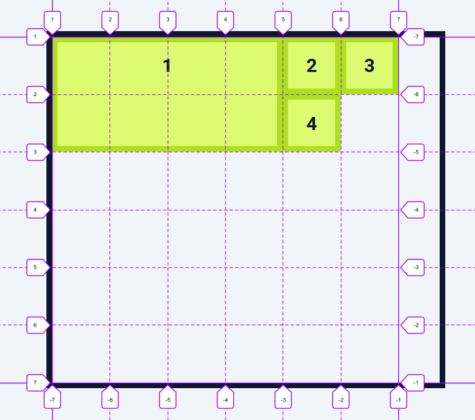
if I want to position an item I can select it and give it the grid row start grid row and grid column start grid column and properties inside of each we'll give the starting and ending line numbers.
.item-1 {
  grid-row-start: 1;
  grid-row-end: 3;
  grid-column-start: 1;
  grid-column-end: 5;
}
this defines the size of 1st item from 1st to 3rd row and 1st to 5th column. Other 3 items are pushed aside because they don't have any position defined.
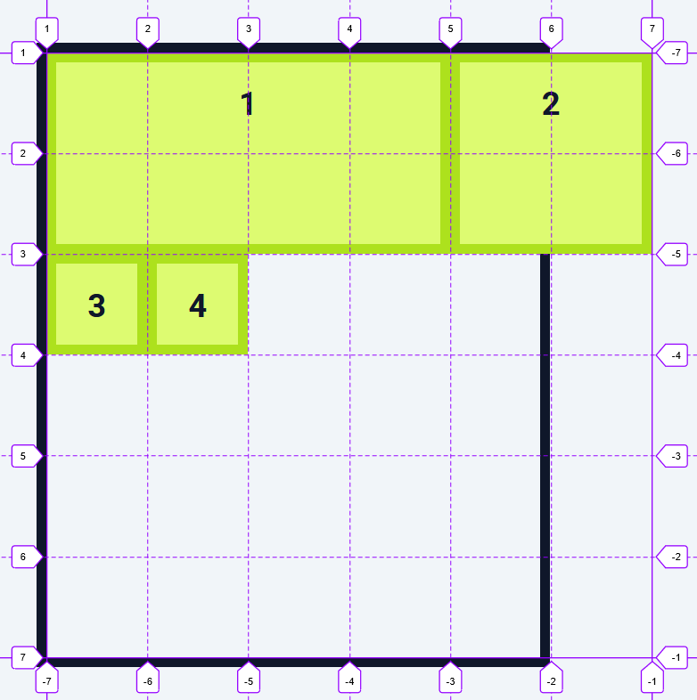
writing these four properties each time is repetitive, instead we can use two shorthand properties grid-row: and grid-column: like other properties this also takes the same number input that is item start and end position in the grid separated by a slash (/).
.item-1 {
  grid-row: 1 / 3;
  grid-column: 1 / 5;
}
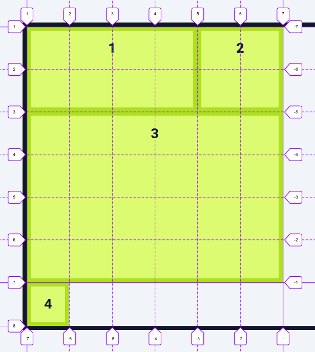
Span
instead of the values that we currently have, we can use the span: keyword to tell the item the number of cells to span in both row and column direction from wherever it current position is. But unlike the specific position span expands the item from wherever it is.
.item-2 {
  grid-row: span 2;
  grid-column: span 2;
}
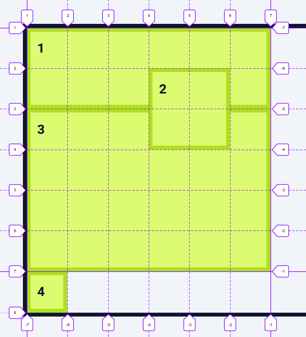
Grid-area
Grid-area: is a faster method to define the size of an item. grid-area takes four values the first is the starting line of the rows, the second is the starting line of the columns, the third is the ending line of the rows and the fourth is the ending line on the columns. grid-area: row-start / col-start / row-end / col-end;
.item-3 {
  grid-area: 3 / 1 / 7 / 7;
}
Layering:
before CSS grid layering an item on top of another was painful, as we had to use an absolute positioning and then try to position the item using the top right bottom and left properties but with CSS grid, we just position item where we want it to be and if that happens to be on top of another item then that creates layering.
Let's say I want item 2 to be layered on top of both the item 1 and item 3.
To do this I'll remove the grid row and grid column and use the grid area instead. The row starts at 2 ,the column starts at 4 the row ends at 4 and the column ends at 6. Our item needs to be on top, so all we have to do is give it a z index of 1 and now item two is layered on top of both item 1 and item 3.
.item-1 {
  grid-row: 1 / 3;
  grid-column: 1 / 7;
}

.item-2 {
  grid-area: 2/4/4/6;
  z-index: 1;
}
.item-3 {
  grid-area: 3 / 1 / 7 / 7;
}
will be continued later....


